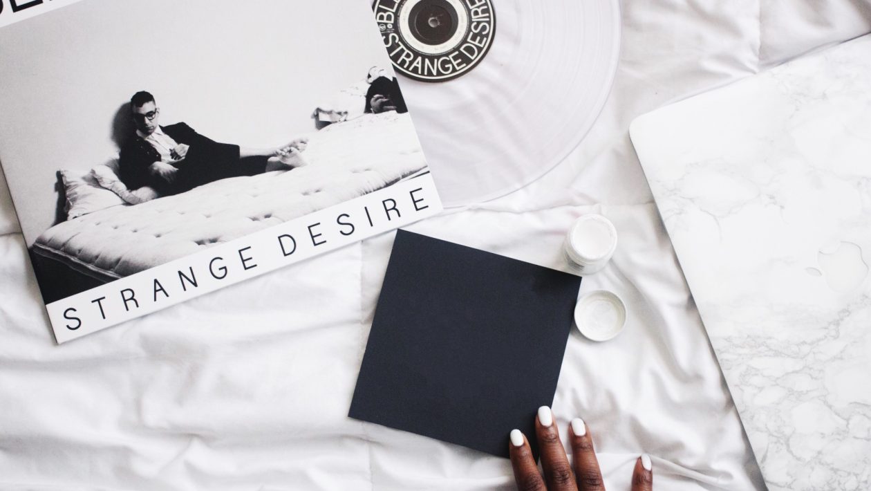
Are you using your album cover art as best as you can?
You might think that an album cover is for advertising and for the CD case, but think again. It’s also for social media, cover plays, when someone asks what your favorite song is, and more. The same applies to artists, especially the famous ones.
Keep reading to learn why and what you should use in designing album cover art.
Table of Contents
Creative Uses of Text
Text can be added to communicate an artist’s vision and create a mood or tone. By utilizing different fonts, sizes, boldness, and angles, the text creates a unique and eye-catching element to the cover art, stimulating those who see it.
Furthermore, the artist can choose to add poetry, lyrics, accolades won, or even a personal message to the audience. Artists could also add a slogan or quote that personifies their music and reflects the content of their album.
The possibilities are endless and the text used to embellish album cover art can serve to create an instantly memorable experience for the listener.
Incorporating Visual Elements
Album cover art should make a statement about the music it represents. Visual elements such as color and design should be incorporated to create a powerful aesthetic that reflects the album art design.
Using elements like geometric shapes and bold colors, the cover art should complement the music in creating a visual identity for the album. Natural elements like animals, plants, and landscapes can add subtly and create a narrative for the cover.
Utilizing Unique Color Schemes
In album cover art, unique color schemes can really add to the overall aesthetic. Bright, primary colors are a great choice if you want to draw attention to the artwork. The use of vivid shades and bold accents can also create an eye-catching effect.
On the other hand, subtle, muted tones can be used to create an air of mystery or even a sense of nostalgia. You could also use a complementary color scheme to draw attention to particular visuals.
Taking time to think about a color palette can really add depth and personality to an album cover art piece.
Maximizing Typography Design
The album cover art is an important tool to represent the artist’s brand, so maximizing typography design is key. As the cover art should be eye-catching, dynamic font treatments and treatments of text will be essential.
To ensure the text stands out, adding features such as drop shadows, outlines, and tapers can help enhance the look. Slanted and curved fonts add an edge, as do 3D designs. Writing within shapes or with varying thicknesses of typeface helps add a unique twist.
To further reduce clutter, elements such as thin dividers, strong lines and typographical illustrations can be used to separate areas and make the cover art interesting.
Make an Album Cover Art Now
In conclusion, the right album artwork can be the difference between an album gaining popularity or falling into obscurity. Creative and eye-catching graphics and text can be added to make a great impression and appeal to listeners.
So, if you’re ready to launch a great album cover art, get creative and utilize the power of design.
Did you find this article helpful? Check out the rest of our blog.

